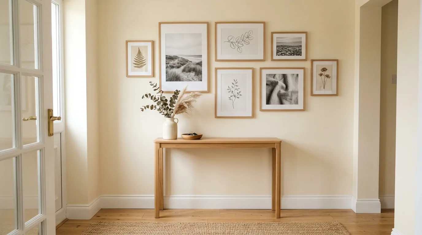
The blank wall above our sofa stayed unfinished for months because I couldn’t figure out what belonged there. My first attempt looked scattered, my frames felt too small, and the spacing made the wall seem even wider than it actually was. After taking everything down and starting again, I finally understood what had been missing: a clear layout.
A simple gallery wall doesn’t need a dozen matching frames or expensive artwork. The right combination of frame sizes, consistent spacing, personal pieces, and a few carefully chosen colors can make an empty wall feel finished without making the room look crowded. That’s especially useful in our 1,050 square foot townhouse, where every decorating choice has to earn its place.
In 2026, I’m leaning toward gallery walls that feel personal and relaxed rather than perfectly matched. Natural wood frames can sit beside black ones, thrifted artwork can work with modern prints, and family photos can share space with botanical sketches. The result feels collected over time instead of bought as one complete set.
In this guide, you’ll learn how to plan a simple gallery wall, choose the right frame sizes, space each piece, mix artwork without creating visual clutter, and build the whole arrangement on a realistic budget. I’ll also share the mistakes I made along the way so you can avoid unnecessary holes, awkward spacing, and frames that simply don’t work on the wall.
1. Start With One Strong Anchor Piece
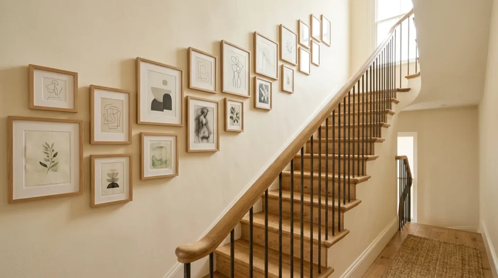
The easiest way to make a simple gallery wall look intentional is to begin with one larger piece. That artwork becomes the visual anchor, while the smaller frames support it.
For our living room, I started with a neutral landscape print. It wasn’t expensive, but its warm beige and muted green tones worked with our wood furniture. Once that frame went up, choosing the remaining pieces became much easier.
A good anchor doesn’t need to dominate the entire wall. On a narrow wall, a 16 by 20 inch frame can work well. For a wider wall, a 24 by 36 inch print gives you more room to build around.
Before buying anything, measure the wall and mark the furniture below it. I like to leave enough breathing room between the artwork and the furniture so the arrangement doesn’t feel squeezed.
If a West Elm or CB2 print isn’t in your budget, try a $15 $30 printable from Etsy or look through your local Goodwill. An inexpensive frame can make a basic print feel much more substantial.
2. Keep the Color Palette Quiet
A gallery wall doesn’t need every frame and print to match, but the colors should have some connection.
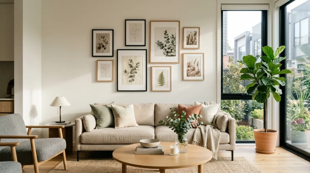
My favorite combination for 2026 is warm white, soft beige, muted green, charcoal, natural wood, and a little black. That palette works especially well with the warm Scandi and Japandi direction I’ve used throughout our townhouse.
This doesn’t mean every image needs the same colors. A black-and-white photograph can sit beside a faded botanical print if both share a similar visual weight.
The Colorado sun also changed how I think about artwork. Our rooms get strong natural light, especially around midday. Some colors that looked soft inside the store felt much brighter against our walls at home. Now I hold prints near a window before committing to a full set.
For a lower-cost option, Target often has affordable frames that you can mix with thrifted wood frames. You can also spray paint a mismatched frame if its shape works but its finish doesn’t.
3. Mix Frame Sizes Without Making the Wall Messy
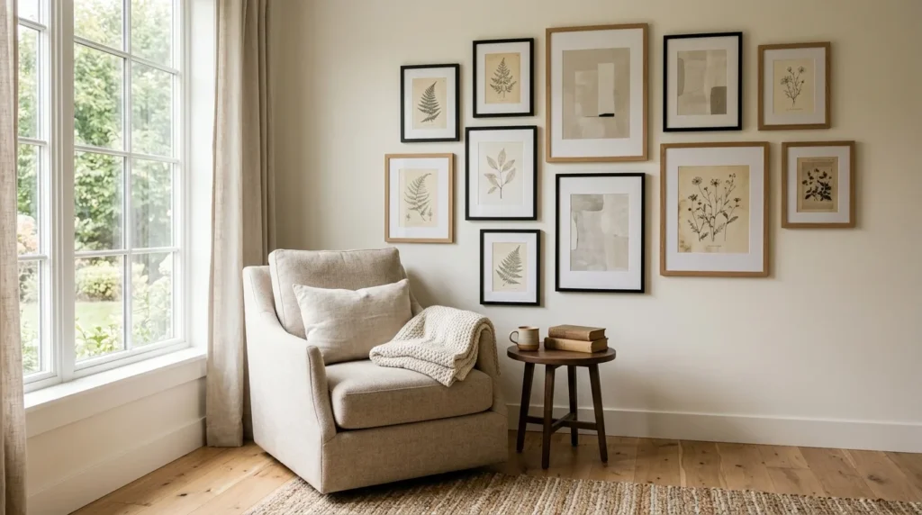
Perfectly identical frames can make a gallery wall feel like a catalog display. Too many different sizes, however, can make it look accidental.
The trick is to create a few repeated elements.
For example, you might use:
- One large frame as the anchor
- Two medium frames on opposite sides
- Three or four smaller pieces to fill the gaps
- Two frame finishes repeated at least twice
That repetition gives the arrangement some structure.
On one of my earlier attempts, I used five completely different frame styles because I thought the mix would feel collected. Instead, the wall looked busy. I removed two frames and replaced one with a simple black border. The result felt much calmer.
If you’re starting from scratch, don’t buy ten frames immediately. Start with three or four. Put them on the floor, move them around, and take a photo before making holes.
For a budget setup, IKEA frames are an easy starting point. At around $8 $20 each depending on size and style, you can build a useful mix without spending hundreds of dollars.
4. Use Consistent Spacing
Spacing sounds like a tiny detail, but it can make or break a gallery wall.
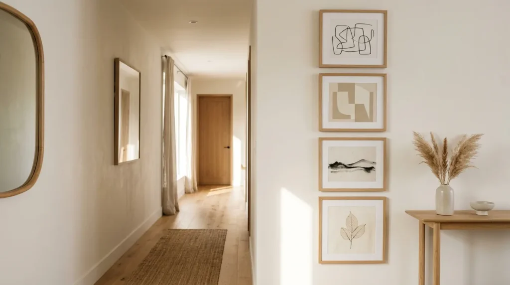
I usually aim for roughly 2 4 inches between frames. Smaller gaps work well when the collection is compact. Larger gaps can work on a wide wall, but too much space can make separate pieces look unrelated.
The important part is consistency.
My first attempt didn’t go smoothly. I measured from the edge of each frame instead of measuring the center points, and by the third frame, the arrangement had shifted several inches. That meant another trip to Home Depot for wall anchors and patching supplies.
Now I lay everything on the floor first and mark the center of each piece. A simple paper template also helps. Cut paper to the size of each frame, tape the shapes to the wall, and move them around until the arrangement feels balanced.
This method takes longer before you hang anything, but it saves you from repairing unnecessary holes later.
If you don’t want to buy a measuring tool, a basic $10 $15 level and a pencil are enough for most gallery wall projects.
5. Add Personal Pieces Instead of Only Decorative Art
The best simple gallery walls usually tell you something about the person who lives there.
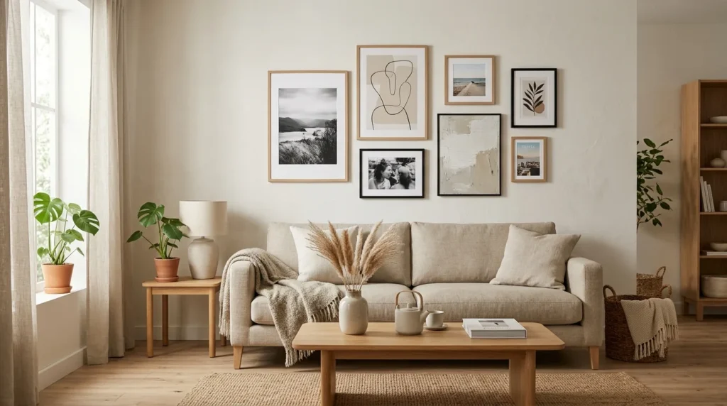
That doesn’t mean you need wedding photos, family portraits, or sentimental objects in every frame. A travel photograph, a handwritten recipe card, an old postcard, a small sketch, or a page from a vintage book can add personality.
For our home, I’ve mixed simple artwork with photographs that actually mean something to us. That small detail keeps the wall from feeling like a collection I bought in one afternoon.
A personal piece also gives you more freedom with the budget. Instead of spending $40 $80 on another decorative print, you can frame something you already own.
Facebook Marketplace can also be useful for finding old frames. I’ve found that the frame matters almost as much as what’s inside it. A slightly worn wood frame can add warmth beside newer pieces.
Just check secondhand frames carefully before bringing them inside, especially if they have visible damage or signs of moisture.
6. Build the Wall Around Your Furniture
One of the easiest mistakes with a simple gallery wall is ignoring what’s underneath it.
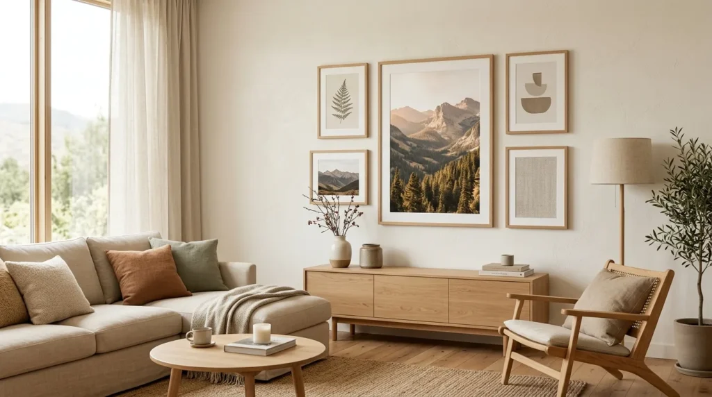
A gallery wall above a sofa should relate to the sofa’s width. The same idea applies above a console, desk, bed, or dining area.
Our townhouse doesn’t have a large formal dining room, so I pay close attention to vertical wall space. Artwork can add interest without taking away floor space, which matters when every few inches count.
For a sofa wall, I generally prefer an arrangement that occupies roughly two thirds to three quarters of the furniture width. The exact measurement depends on the frames, ceiling height, and furniture shape, but the principle helps prevent a tiny cluster from floating awkwardly above a large sofa.
Our main floor has 9 foot ceilings, so I can place artwork a little higher than I would in a room with standard 8 foot ceilings. Upstairs, where the ceilings are lower, I keep the arrangement more compact.
If you’re working with a narrow wall, don’t force a wide horizontal arrangement. A vertical stack of three or four frames can look much better.
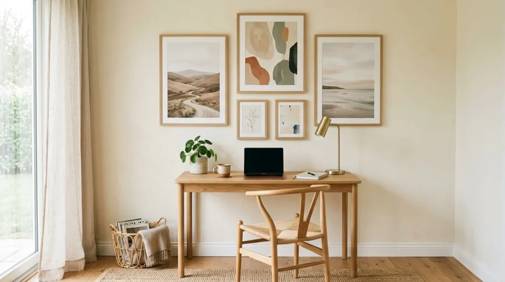
7. Try a Thrifted and New Mix
A completely new gallery wall can feel too polished. A completely thrifted collection can take longer to pull together.
Mixing the two gives you more flexibility.
I like buying one or two new frames in a finish I know will work, then adding thrifted pieces around them. Our local Goodwill has occasionally been useful for inexpensive frames, while Target and IKEA fill the size gaps when I can’t find what I need secondhand.
A realistic budget might look like this:
- Three basic frames: $30 $60
- One larger frame: $20 $45
- Prints or photos: $10 $30
- Hanging supplies: $8 $15
- Optional thrifted frame: $5 $15
You don’t need to spend $200 before you know whether the arrangement works.
Another lesson I learned: don’t buy a frame just because it’s cheap. I once brought home a large ornate frame because it cost only $12. It looked completely out of place beside our simple wood furniture. The price was good, but the scale and style were wrong.

8. Add One Unexpected Shape
A gallery wall doesn’t have to contain only rectangles.
One small round mirror, a narrow woven piece, a shallow wooden object, or an unusual vintage frame can break up a predictable grid.
For a simple arrangement, though, keep this idea controlled. One unusual shape can add interest. Five different shapes can make the wall harder to balance.
I particularly like small mirrors in darker rooms because they can bounce light around the wall. Just keep safety in mind if you have pets. A heavy mirror or frame needs the correct wall hardware, and anything above a walkway should sit securely.
With Miso racing around the house at odd hours, I don’t hang fragile pieces where they could easily get knocked down.
For renters, removable hanging strips can work for lighter frames, but always check the manufacturer’s weight limits and your lease before using them.
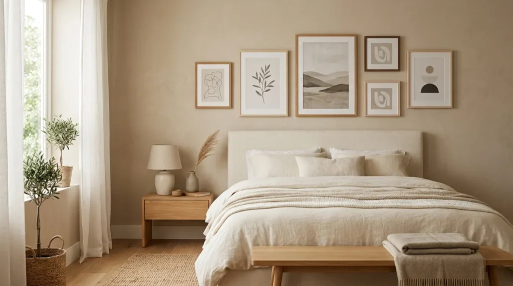
9. Leave Some Empty Space
This might be the hardest rule for anyone who loves collecting art.
You don’t have to fill every inch.
A little empty wall around the arrangement gives each piece room to breathe. It also makes future additions easier. If you find a meaningful photograph six months later, you can add it without rebuilding the entire wall.
After living with our decor for several years, I’ve become much more comfortable stopping before the wall feels full. That change saved me money, too.
The goal isn’t to prove how much artwork you own. The goal is to create an arrangement that feels connected to the room.
For a budget friendly approach, finish the wall with five or six pieces and wait. Live with it for a few weeks before buying anything else. Your next decision will usually become much clearer.
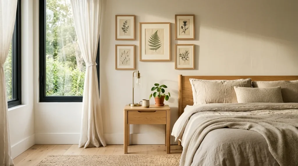
What Went Wrong When I Tried It
My first simple gallery wall taught me two useful lessons.
The first problem came from spacing. I rushed the measurements because I wanted to finish the project in one afternoon. The frames ended up slightly uneven, and the problem became obvious every time the afternoon sun hit the wall. I eventually took everything down, filled the holes, and started again.
The second mistake involved scale. One frame looked fantastic by itself but felt enormous beside the other artwork. I kept trying to make the arrangement work instead of admitting that the frame was wrong for the wall.
That experience changed how I shop. Now I measure first, photograph the wall, and check the dimensions of every frame before buying it.
The small DIY part also had its messy moment. One paper template tore while I was moving it, and one mark landed about an inch away from where I wanted it. Nothing dramatic happened, but it reminded me that gallery walls reward patience more than speed.
If you’re hanging anything heavy, use wall hardware rated for its actual weight and wall type. For larger or unusually heavy pieces, consult a qualified professional rather than guessing.
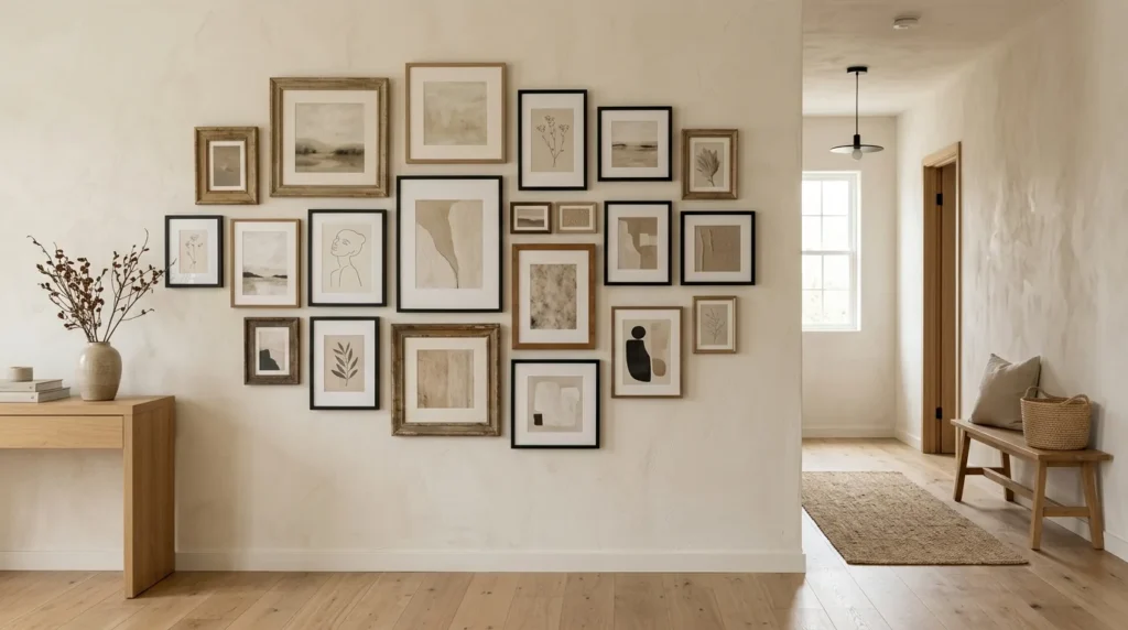
A Simple 2026 Gallery Wall Formula
If you’re completely stuck, start with a simple formula instead of trying to invent the arrangement from scratch.
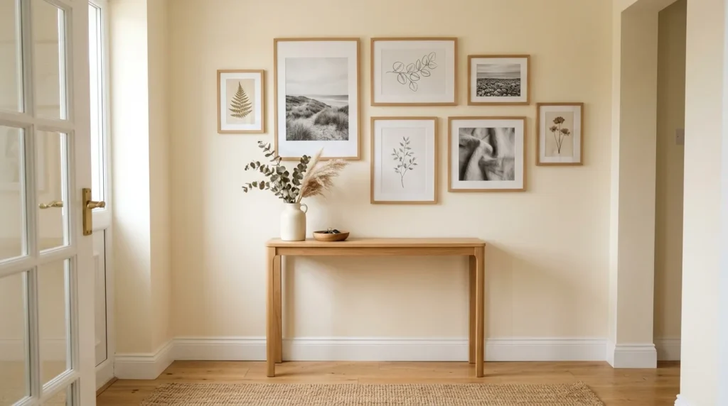
Choose one large frame, two medium frames, and three small pieces. Keep two frame finishes consistent, then allow one different finish for character. Pick artwork that shares two or three colors, but don’t make every print identical.
For the first layout, try an asymmetrical arrangement. It feels more relaxed and works well with the mixed-frame direction that’s popular in current interiors.
Once everything sits on the floor, take a photo. Look at the image in black and white if you’re unsure about balance. This removes color from the equation and makes it easier to spot areas that feel too heavy.
Then move the pieces until the visual weight feels even.
That five-minute planning step can save an entire afternoon of patching and rehanging.
Final Thoughts: Keep Your Gallery Wall Personal
A simple gallery wall doesn’t need a designer budget or a perfect collection of artwork. Mine came together slowly, with a few mistakes, some thrifted frames, and plenty of rearranging. That’s probably why I like it more now than I did when I first started decorating our townhouse.
Start with one piece you genuinely like. Measure the wall. Keep the spacing consistent, mix a few textures, and leave enough empty space around the arrangement. Most importantly, don’t rush to fill every gap.
If you’re planning your own gallery wall, save this guide and use the layout ideas as a starting point. For more practical decorating ideas that work in real homes with limited square footage, explore the other room by room guides on CompactDecorHub.